


Week 5 - George Cotronis
Art can be used for much more than just looking pretty, which is why I've chosen to focus on an illustrator who creates more than 'just art prints' (not to say that is not a legitimate career path in and of itself, but rather that people tend to forget how art is incorporated into our daily lives beyond pictures on a wall).
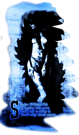
George Cotronis (also known as Yorgos Carlos Cotronis) is a Greek illustrator and designer, currently residing in Athens. He makes a living designing book covers and is known for his dark, atmospheric genre illustrations. While book covers are his main gig, he does a bit of work for board game illustration as well, which is how I came across his work.
For this task, I want you to take a look at his portfolio of work and choose one image to inspire an outfit. How you choose to interpret the images is up to you, however if you think an explanation would be beneficial, I encourage you to send that alongside your submission.
Instagram: @ravenkult
Website: cotronis.com
BoardGameGeek: @northerain
Due Date: Up and Coming Designers
Have you got what it takes?


Due Date: Established Designers


Please note: I am heading on holidays this week and next week so I'm going to be less active around submission time. Please take that into consideration as you seek feedback/wait for panels and previews.
The Collection
Established Designers
Anejo
lidl-wayne
Peyton125
Snawl
alydaman


The Collection
Up and Coming Designers


Sparkle
SealChowderr
rozuyumiko
Grimmish
EagerGamin


Critiques
This outfit is a bit heavy with detail, and I wonder if there is perhaps a bit too much of the cream colour incorporated throughout the look. In saying that, I LOVE the jacket/shirt combo with that little bit of pink peeping through. I think the head is where you lose me a bit. The eyepiece and the hat make sense, but its the hair that just gets a bit too weird for me, but I can see how it is similar to the hair on the image.
This week, because I'm on holidays, I have also asked my partner for feedback, and he said I made the wrong call with the outfit
submission - he preferred the one which was simpler. Don't
worry, his opinion doesn't count for shit here.
Anejo aka Mickey
Established Designer
Design brief: 8/10
Innovation: 7.5/10
Fashion design: 7/10
I love this so much. The way you have translated that eerie dark scenery through the red gradients in the outfit with dark black brooding borders is spectacular. It is a little reminiscent of Razzing's outfit from S3T8 Lidlterm, but I'm not sure if that is just because of the long ponytail you've chosen, or the clear divide in the outfit.
This week, because I'm on holidays, I have also asked my partner for feedback and he too thought this outfit was cool.
Grimmish aka Caz
Up and Coming Designer
Design brief: 10/10
Innovation: 7.5/10
Fashion design: 8/10


You shared that when submitting this, you wanted to give me little red riding hood couture, rather than a 1:1 replication of the image, using the colours and lettering as inspiration. I think as a standalone outfit, this design is rather interesting. there are a lot of little details that are unique while still communicating that essence in the design. My favourite part of the look is the way the white elements dash in and out from underneath the jacket. I do however struggle to see the link to the image.
This week, because I'm on holidays, I have also asked my partner
for feedback. His comments were that the design was not
dark enough.
Peyton125 aka Peyton
Established Designer
Design brief: 6/10
Innovation: 8/10
Fashion design: 9/10
I'm really loving this design this week. I'd even go as far as saying it is my favourite thing you have submitted this entire season! The decision to create a nude illusion on the arms and have the flowers popping out from the arms really ties it back to the artwork clearly, while the steel-grey silver of the vest/stethoscope are reminicent of the armour. There is something high fashion here which truly
stands out as unique in the design which still remaining simple enough to be wearable. Well done.
My partner got sick of giving feedback and so our friend Amanda
has provided commentary for this outfit with "definitely a similar vibe to the artwork".
SealChowderr aka Lusealiya
Up and Coming Designer
Design brief: 8/10
Innovation: 7/10
Fashion design: 9/10
First of all, let me congratulate you for not being the last to submit a design this week. I was very much not expecting that.
When you submitted this design to me, I was in the airport and you gave me a very specific artist description, which mentioned the obvious "imperialistic, militaristic [and] Nazi overtones" of the artwork. Now I know I'm Aussie, and very politically unaware in comparison to my partner, so I of course showed him the artwork to see if I was dumb and missed the obvious theme of the image. He has assured me it is not obvious even though I am not clued in.
What I can say however is that I think you translated the artwork into fashion perfectly even if we don't see the same things. I particularly love the way you have the red strokes of what would
technically be hair coming down from the hat, and how it looks
like it is woven perfectly into the material to create this
structured jacket design. The blend from the flannel into
the skirt is also top notch. Well done.
alydaman aka Alex
Established Designer
Design brief: 9/10
Innovation: 10/10
Fashion design: 10/10

I think I both love and hate this design. The things that stand out to me are is the silhouette of the dress down to the shoes. The way the necklace interweaves with the stars on the shirt and creates this elongated feel to it is very clever, if not the best way of presenting that retro jacket/shirt piece I've seen to date. I can see why you have used the armour shirt in your design based on the visual inspiration, but I wish you had left some skin showing and instead used the cyber pants or armour pants. I think this would have achieved the modern nightcore aesthetic you were going for, while still leaving space for the design to breathe. This breathing space is perhaps required more because of the singular colour tone of the actual outfit itself.
rozuyumiko aka Paowee
Up and Coming Designer
Design brief: 7/10
Innovation: 8/10
Fashion design: 8/10

As you know, I can't do minimalism, so I truly appreciate it when someone else nails it. This design truly captures the division in the colours of your chosen art piece in an absolutely stunning way. Those little peeps of pink popping out from the red which weaves
through into the jacket is just *chefs kiss* and the way the shirt
piece appears to be diagonal. The only nitpicky thing I have
against this design is the fucking ramen hair. Like its not bad
but it's not great either and I'm just stuck getting distracted by
how dumb this retro art looks.
When asking for feedback about this look from the room, I
got a discussion on the difference between the
greatest and the best batter in cricket and why they are
different. I think they got over talking about PR, but feel free to take credit for being the greatest or the best.
Snawl aka Brad
Established Designer
Design brief: 10/10
Innovation: 8.5/10
Fashion design: 10/10

Ok, so first of all, I love this art piece. It is sexy, it is between genders, it is formal. Just an overall vibe, and a very clever choice when it comes to trying to utilise that lion shield back piece.
Because of the fixed nature of this item, it can be very hard to incorporate into an outfit but because the idea is shown in your inspiration art, it makes sense to make this large and bulky piece a centrepiece to the design. I love the way the sleeve on the right juts out from behind the shield, giving a cutaway to what is below, and the continued emphasis of gold on the right behind the sword works well. I will admit, that fur piece is one I have always struggled to appreciate in PR, but I think the volume that it provides while creating an assymetrical design that ties back into the
bronzed tones of the shield works quite well.
Sparkle aka Sarah
Up and Coming Designer
Design brief: 9/10
Innovation: 7/10
Fashion design: 9/10

The flow of this outfit is gorgeous and I honestly have no idea what items you have chosen to use for the shirt. The colours from the outfit have translated nicely to give that moody, spooky feeling. I appreciate the kiss of black shown in the head piece, and I'm glad
you brought the earring in to expand that head design as it
elevates it somewhat compared to just being the weird alien
thing. There is something about how your colours blend in this
design that I just cant look past. Anyway that's all I have for
feedback this week. I have consumed a lot of plum wine.
lidl-wayne aka Filip
Established Designer
Design brief: 8/10
Innovation: 7.5/10
Fashion design: 10/10

The Results
-
alydaman - 29
-
Snawl - 28.5
-
Grimmish - 25.5
-
lidl-wayne - 25.5
-
Sparkle - 25
-
SealChowderr - 24
-
Peyton125 - 23
-
rozuyumiko - 23
-
Anejo - 22.5
Task 5 Rankings
Each week is getting tougher to survive, and todays results are no exceptions. The scores are getting tighter and the differentiation is getting more and more nit picky as we proceed int he game.
The winner of this task is alydaman - this design was so unique and structured (true to the elements you interpreted within the art piece). Well done. A truly stunning submission. I wish I had thought of it.
Today we say goodbye to Mickey. Not because he isn't an incredible designer, but because the submission at the end of the day felt just a bit too overwhelming and cluttered in comparison to everything else that was submitted.
My partners concluding feedback is something about a story of this dude called Hoggy from Australian cricket who retired early due to a failing marriage, and then had a 15 year gap before returning to cricket at all where he dominated in some local club cricket and then picked up a Big Bash League contract and had an absolute comback. Now I have no understanding or interest in cricket but he was really passionate about sharing this story and an accompanying terrifyingly scary video. What does that mean for PR? Absolutely nothing, but given his passion on the subject, I thought it would only be fair to share.

