


Task 11 - Finals collections
Congratulations to our four finalists! I am very excited to see what you all bring to this finals round, and I know it has been a long road to get here.
Over these past ten weeks, you have learnt to take inspiration for your designs from many different places. From traditional methodologies, to unconventional concepts, anything can serve as a source of inspiration.
For your final task, we want you to make a 5 piece collection based off something that inspires you. Your collection must be cohesive and showcase your unique point of view. The more original your inspiration or concept is, the better. We want you to think outside the box and be more creative than ever before. The key is to stand out from the other two collections. You're competing for the title of Fresh Faces: Season Two champion, therefore, bring your "A" game and impress not only me, but the audience.
You may choose to use a methodology from a task with editing that was offered within the last ten weeks. If you require editing assistance from me, make sure you leave extra time for your submission as I will provide you with one draft with no feedback around my usual day-to-day schedule if you choose this route. (There are also other talented photoshop users in our community who may be able to help you out here)
Be sure to let us know your inspiration when submitting your final designs for judging so we have the best information to judge you fairly! It is also worth noting, track record will not be taken into consideration during deliberations to announce a winner, so make sure you give it your all.
If you are not sure where to start, have a look at what our finalists in season one submitted for their finals collections here.
Due Date:
Have you got what it takes?


I can't remember feeling this miserable
Lidl-Wayne, 2023

Paint the Town Red
Alydaman, 2023

Metamorphisis
Anejo, 2023
untitled
rozuyumiko, 2023


What a Season we have had on Fresh Faces, and with a cut throat finale jam packed with talent!
Now, before I start to wrap up and unpack the finale, I just want to take a moment to reflect on the season: I feel very fortunate to have had the S2 cast simply because of all the different perspectives everyone has brought to the game. Although we did lose many players to circumstance, and others to the lowest score, this season has presented many an outfit which sparks joy. That is part of why I love creating the designerology page so much. It gives everyone a chance to look back and truly appreciate all of the variety on offer. I would also like to thank everyone for their seemingly endless patience, especially towards the end. I know I have had a lot going on lately, so I appreciate those who have checked in and understood why the delays have been happening. Ya'll know I love Project Runway, and I wanted to make sure I give you all panels which match the effort everyone has been putting in each week.
It would be amiss of me to not also acknowledge our wonderful guest judges. Nicro and Lance had their first crack at giving feedback and I hope they learnt a lot from the experience and we see them more often on the other side of the panel. Meanwhile Arber has been constantly in my DMs offering unsolicited opinions (see: reaction gifs) throughout the weeks. And Harry, my unofficial 2ic of the season - I honestly don’t know how I would have pulled through all these weeks to the end of this season without him. Life can be rough, but when others take time out to help you in the small ways it makes such a huge difference, and Harry, through his dedication to the task podiums, and encouragements, and critiques/love/laughter behind the scenes has been the constant I personally needed in this game. So thank you.
Now that I’ve gotten all soppy and emotional (which seems to be my default state at the moment), I guess it’s time to look at the mixed bag of outfits that have graced our runways for the finale. As I’m writing this, I have not decided a winner, but I hope you all feel that you are winners just by being here and presenting your collections.
A note from Elysse:


Critiques
Lidl-Wayne aka Filip
Established Designer
I can't remember feeling this miserable
Artist Statement
My collection is inspired by the show Severance. In short, it features people who work at a company in which they lose all memories and non-practical knowledge when they enter work, and thus they become themselves again when they leave work with no idea about what happened at work. Thus, one individual lives two separate lives. These two selves of the individual have no idea about what goes on with each other. However, the lesson is that they are both (the same) human, so the emotional life of the two selves affect each other. The main character, like many others, choose to work at Lumon in order to escape trauma and pain, from losing a loved one, in the workplace. Thus it turns out that you can't escape your emotions, they trickle down no matter how hard you try to push them away. Severance tells us that pain is a cruel yet beautiful part of life, and that it is ultimately connected to the strange yet beautiful part of life, rendering life as dull and pointless without it. That is the philosophy I went by with this collection!
-
Look 1 - It's a literal take on pain, trauma and to feel like you're bleeding.
-
Look 2 - For this one, I wanted to showcase the very specific office-core aesthetic of the show.
-
Look 3 - Sorry for the mix of references, but I couldn't get Marie Antoinette out of my head so here is dystopian future Marie Antoinette. I love fishnets so I wanted to feature some.
-
Look 4 - I wanted this look to represent the duality: it looks like wounded office wear - but it could also be a look for a night out. The black fabrics are supposed to portray memory loss.
-
Look 5 - For every look of the collection, the idea I worked by was that each outfit should look a little dirty and yet clean at the same time. I wanted the sleeves to kind of resemble tears while the black piece to me represents workplace structure.
First Impressions
I’ve never seen Severance, but from what I understand, you are trying to create a collection which is inspired by corporate wear, being overtaken by emotion until it can no longer be contain. I think that the choice of colour has really helped sit these outfits into that corporate agenda, which the mix of smart casual styles has created an interesting relationship between that corporate persona and the other. These looks for the most part feel like a good balance between these two halves, even if the intent of the show is to shut them off, however that helps it lean into the ideal you are trying to hammer home: the life is pointless without the experiences of joy and pain to balance each other out and help us understand what we are going through.
Corporate hues, as we pay our dues, working the nine to five. Hear the cries as we look alive, your persona is overdue.


Look 1
The layering on this piece is impeccable. They are visibly there but look very much like they are a part of the same intricate dress coat. As a whole, this look feels very closed up and hidden from the world, with the pain coming through anyway. There is beauty in this piece despite its sadness.
Look 2
This look to me feels so wearable. There is that custom crafted snakeskin looking vest you have designed which gives the outfit a fresh youthfulness, paired with these flow slacks tucked into shoes which add a bit more personality. The jumper is the part that feels a bit more dated, but you added a racing stripe sleeve decal out of the same material as the vest and it truly brings new life into the piece. I know you were going for an office look here, but to me, I see something so much more. It is fashion forward. I love it.
Look 3
What is interesting about this look is the silhouette you have created with your colours. The way that red is overlapped and consumed by the black is gorgeous, and what gives it this ‘passion overflowing’ feel - it literally looks as though the colour is pouring out over the look. I know the silver at the bottom is the result of pant legs, but for me, I’ve been enjoying the idea that it is a tight fishtail style skirt with different panels as it goes down. I don’t really see Marie Antoinette outside of the hair style inspiration, but I think that works in your favour because I don’t understand the connection between her and your collection as a whole.
Look 4
This look was the business casual mix, and to me it feels as though your personality is bleeding out of the corporate wear and trying to escape by dripping down your legs. I like the small little red detail peeping out at the top and how it ties into your shoes. There is a lot of thought that seems to be in this look which at a glance could come across as deceptively simple.
Look 5
This is one of the more difficult looks to pull off in my opinion, simply because you have chosen to create a back look using a floor length jacket, the only additions you can add become what you are able to glitch through. This is not to say you haven’t created a gorgeous outfit, just that the energy for this one feels a little different because of the limitation you have imposed upon yourself by using the Kimono by Push. I do appreciate that you have pivoted into a walking design here because it adds a little something extra which the look needs. I like that the glitching straps make it look like your model is wearing black gloves ad the capped sleeves that are breaking through at the top. The peeping blue above your shoes is a gentle detail which ties back into the arms well.
Look 1
Design brief: 8/10
Innovation: 8.5/10
Fashion design: 8/10
Look 2
Design brief: 9.5/10
Innovation: 9.5/10
Fashion design: 9.5/10
Look 3
Design brief: 8.5/10
Innovation: 6/10
Fashion design: 7.5/10
Look 4
Design brief: 10/10
Innovation: 9/10
Fashion design: 10/10
Look 5
Design brief: 7/10
Innovation: 6/10
Fashion design: 7.75/10


Critiques
Alydaman aka Alex
Established Designer
Paint the Town Red
Artist Statement
To explain my inspiration for the collection: This collection is my expression of cool street wear meets modern art meets caged animal. It's a collection that wants to beat you up, if you will. It represents essentially saying "fuck it" and somewhere between liberation and self destruction. So I wanted to make it very bold and in your face using strong colour and having most of the models looking head on to give maximum attitude.
First Impressions
This collection has surprised me - not for its colour palette, but simply because it is a bit more chaotic than the bauhaus style you have been leaning into more recently. You have a breakdown throughout this collection which moves away from the strong, sharp, cleanly silhouettes you have been boasting and into a far more grunge aesthetic. Given you were trying to portray street wear meets modern are meets caged animal, this makes sense.
Dripping Hues of Red
The clothes fall away from them
Senseless on their own

Look 1
While this look is chaotic, there is so much that works about it: the layers on the skirt which all feel disconnected, yet united in the style, the pops of repeating colour in the orange, the United red amongst the whole look, and the neutral shades in the hat and shoes to balance it out. If there was one critique for this look it would be that my brain didn’t know where to look first. Do I think it is gorgeous? Yes. But I needed this look to sit with me before I could truly appreciate the beauty presented.
Look 2
You’ve cracked the ceramic bowl and instead of repairing her with gold leaf, you’ve joined it back up with pitch black tar. This feels edgy and fresh and effortless; even though I’m sure that these choices to create this piece were painstakingly measured and calculated.
Look 3
I’m torn as to whether I feel this look is out of place in your collection, or the variety it needed. In no way do I think your colour story needs to be duplicated across every look, but the simplicity of the fabrics at the bottom half of your design are such an innocent contrast to what you have going on up the top which definitely evokes that grunge street fashion feel with what I am deeming your fur trench coat. An interesting look.
Look 4
The graphic designer in me is obsessed with your segmentation of the colours. The way it creates basic shapes as the colours move down the body is just so eye catching. this asymmetry also provides a point of interest that leans into the street style. I particularly appreciate how you have made the tartan sash feel new by extending the red down all the way to the toes.
Look 5
This is a look where I KNOW you’ve glitched it, but for the life of me, I haven’t figured out how you made it happen. I love the way you have these striking red lines draping all the way down the body is just stunning. The blue sporty stripes on the shoulders are also a nice pop of colour on this outfit. Very graphical and striking.


Look 1
Design brief: 9/10
Innovation: 8/10
Fashion design: 8.5/10
Look 2
Design brief: 9.5/10
Innovation: 9/10
Fashion design: 9/10
Look 3
Design brief: 5/10
Innovation: 8.5/10
Fashion design: 7.5/10
Look 4
Design brief: 10/10
Innovation: 8.5/10
Fashion design: 10/10
Look 5
Design brief: 8/10
Innovation: 10/10
Fashion design: 8/10


Critiques
Anjeo/Player aka Mickey
Established Designer
Metamorphisis
Artist Statement
In this transformative and symbolic clothing collection inspired by the metamorphosis of a butterfly, each piece serves as a metaphor for the evolution of the human mind. The collection unfolds like the stages of a butterfly's life, beginning with the caterpillar representing the nascent mind, depicted through cozy and cocoon-like silhouettes. As the journey progresses, the pupa stage is embodied in garments that cocoon the wearer in intricate textures and layers, symbolizing the introspective and transformative phase of mental development. The emergence of the butterfly is manifested in vibrant and ethereal fabrics, mirroring the blossoming understanding and beauty that unfolds within the human psyche. Each garment is a visual narrative, telling a story of personal growth, enlightenment, and the emergence of a more profound understanding of the world. The collection not only adorns the body but also encapsulates the delicate yet powerful journey of the mind's metamorphosis, allowing individuals to wear their own evolution with grace and elegance.
First Impressions
I have to say, of all the supporting material I’ve read so far in the competition, yours is a very deep thinking critical artist statement. I should know, I write shit like that. It’s a lot to chew on and definitely ads layer and meaning to your outfits. There are a lot of different styles here and without your story linking them together, I think it would be hard to envision them all as a collection, however your narrative is the vital bond between each piece which creates a harmony of sorts.
An entanglement of chaos and beauty, two halves warring for control. As power struggles, she grows. An evolution, I suppose.


Look 1
The gradient on this look is INSANE. I love the gradual shift throughout the whole piece, with the mixture of textures throughout. There is something alien/bug like in this mix and match here but also elegant within the colours. I can very much see your egg stage reference in this piece alongside an innocence that is slowly being corrupted.
Look 2
This look feels as though it is wrapped up and hidden away from the world, with a glimpse of detail bursting forth despite the draped fabric. There is so much detail in that small centre section which is engulfed by your large swathes of fabric. I think the mask over the eyes ties in well to this idea that the complexity is not yet seen. An interesting take with a unique journey throughout the different layers.
Look 3
This feels like a natural progression from your last look, the detail on the inside is captivating with lots of depth the more I stare at it. I like the addition of the bow overlapping your belt which looks as though it is a duotone shirt to create distinct sections in your piece. My biggest critique with this look however is your skin tone. I know you like a more unnaturally coloured skin, but paired with these colours, it makes your model look sick and it is hard to look past it here.
Look 4
I like the segmentation in this look. it feels as though as they got older, they started to compartmentalise their life more and more. I think your head piece is absolutely gorgeous. the frills, the shoulders, the face mask, it is just such an intricately detailed space that has layers of complexity which I adore. I kind of wish you didn’t have those two random orange squiggles cascading down into your beige segment. The yellow overlapping the blue is also a superb contrast which is gorgeous.
Look 5
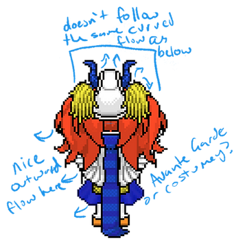
My absolute favourite thing about this look is the outward flow of your elements. Their, wings, skirt, scarf all have that tiny lean which directs the eyes downwards and out. The head pieces are differing to that however which somewhat break the illusion. I think that this is quite extra, very over the top and I’ve decided after sitting with it, more svante grade than costumes. Your re trying to encapsulate that curve of the wing without being the wing itself. I’m not certain if you needed those dark orange colour tones at the top or if you could have gotten away with a lighter tone, but there is something interesting here which has kept me thinking so well done.


Look 1
Design brief: 10/10
Innovation: 9/10
Fashion design: 7/10
Look 2
Design brief: 9.5/10
Innovation: 7.5/10
Fashion design: 8.5/10
Look 3
Design brief: 7.5/10
Innovation: 5/10
Fashion design: 5/10
Look 4
Design brief: 8/10
Innovation: 8.5/10
Fashion design: 10/10
Look 5
Design brief: 9.5/10
Innovation: 9.5/10
Fashion design: 9/10


Critiques
Rozuyumiko aka Paowee
Up and Coming Designer
untitled
Artist Statement
So the hats are my inspiration to this collection. As a fashion accessory, it became popular in 2oth century and in 1900 dress etiquette dictated that a woman should not leave the house without a hat. not only that owning and wearing a unique model of hat signifies social status of the wearer. So every hats has its own shape(which I chose is an irregular shape), style and personality so is the silhouette of each look.
First Impressions
There is a strong colour cohesion going on here, which has been woven through each look and across all of your hats. I like that there is personality to all of the looks, however I feel like at times, despite your collection inspiration being ‘hats’, the headpiece is almost not needed which is such a hard one to wrestle with because I understand they were the ground zero for your collection. I like that you’ve thought about silhouettes though when it came to hat choices.
Hidden behind a statement of wealth, she draws value
not from within. An armour for the less brave.
She will knock you to your knees.

Look 1
My favourite part of this look is the detailing around the top. There are the two layers on the arms which pop because of the different colours, and then the different textures woven onto the chest piece itself creates a dynamic, shabby-chic energy; the way the trim matches the orange feather on the hat in terms of texture is a nice touch. The skirt doesn't continue to help elevate this however, it adds yet another texture into the already chaotic landscape and makes it look dated. Perhaps if you had paired this with some denim blue baggy pants you would have had the right balance to really nail this design. Your colour Palette throughout your entired collection is very strong, but it's also important to not be afraid to throw in something else to give the audience a bit of a reprive.
Look 2
This look is funky and fresh. There is a youthful energy present in the design that perhaps comes with the flowing pants which are so in right now paired with the crop top. I love the shapes that have been created here for the silhouette, its triangular and dynamic. It keeps the eye moving as you look up and down the design. The use of white here is perfect because it helps break up your bold block colours and give breath to the pieces. The hat piece truly is a perfect addition to the clothing you have designed here.
Look 3
It took me a while to come to terms with this look if I'm being completely honest. There is a lot going on, but what I think is really interesting in this look is the texture. The details on the hat, the boa and the rouched dress create an interesting cohesion amongst each other. One of the patterns I have noticed you coming back to in these designs is a maximalist approach which is always trying to cover up the skin, however I think leaving htose arms bare would have elevated the look more, helping us focus on the key aspects of your design.
Look 4
The play between the purple strips on the hat and the dress have a nice cohesion that really work into your design. I think that because of the detail on the dress, you could have really leant into that as the piece with a few small accessories to tie it together. I feel like the pink on the earrings and shoes were shoehorned in at the last minute so that you could include all the elements from your collections colour story, but they don't tie the look together effectively. A different shoe and different colours would have worked better here. A good foundation overall, just needed some refinement.
Look 5
Once again, I feel caught up with the much of muchness. how much fabric can we throw at the look while still getting away with it? Something needs to be removed but it would take a bit more experimentation to figure out what; though I suspect removing the sleeves might do it. I do like the chain body belt, and the matching trim on the hat and corset. The earrings feel a bit cluttered with the sleeves included, but again, more experimentation needed. This look is working towards trendy and street, and it is almost there.


Look 1
Design brief: 10/10
Innovation: 7/10
Fashion design: 6.5/10
Look 2
Design brief: 8/10
Innovation: 7.5/10
Fashion design: 9/10
Look 3
Design brief: 6.5/10
Innovation: 8/10
Fashion design: 10/10
Look 4
Design brief: 5/10
Innovation: 3/10
Fashion design: 3/10
Look 5
Design brief: 7.5/10
Innovation: 5/10
Fashion design: 7.5/10

Leaf me alone
Uhu., LC22, and icearbr, 2023


The Results
WITHOUT FURTHER ADO, I AM EXCITED TO ANNOUNCE THE WINNER OF SEASON 2 FRESH FACES.
Highlight to reveal:
Congratulations to ALEXANDER! You have fought hard and delivered some amazing outfits, bringing home the gold.
What an incredible competition this has been, and the closeness of the final scores in this round is a great reflection on how well you all did. It really was anybody's game! May you all have a happy and safe new year as we get excited for the next long term season: Snawlterm S9 launches in February and I hope to see you all throwing your hat in the ring to have another go at creating brilliant fashion design!
As usual, task rankings and stats are available at the bottom, but in order to avoid spoilers, I have pushed the information down further.
Other winners
Given we had 4 designers in the finals instead of three, I will be awarding 20c to our fourth place winner for their hard work and efforts.
As is tradition, most improved and most consistent designer will be awarded to those who did not make the finals.
Most improved designer: Cassandra.Goth
Most consistent designer: Sparkle
The following outfits have been awarded the status of 'exceptional outfit' and the designers will be awarded 10 credits as a bonus prize for each of them. Please note, that these outfits were not necessarily the highest rank in the round, but something that upon further reflection, have stood out when looking back at the season so far.
This brings our total prize pool to 680c! Congratulations to all for your hard work.


Task Rankings and averages for the finals
alydaman - 25.7
Design brief: 8.3/10
Innovation: 8.8/10
Fashion design: 8.6/10
1
lidl-wayne - 24.95
Design brief: 8.6/10
Innovation: 7.8/10
Fashion design: 8.55/10
2
anejo / Player - 24.7
Design brief: 8.9/10
Innovation: 7.9/10
Fashion design: 7.9/10
3
rozuyumiko - 20.7
Design brief: 7.4/10
Innovation: 6.1/10
Fashion design: 7.2/10
4

